Voices of Vizz: We do more than “just” maps.
At Vizzuality, we believe that data visualization and analysis can make a real difference in the world. But we don't just stop at creating maps. We work with clients across various sectors to deliver the solutions that fit their needs, the data they have and the goals of the platform we co-build.
In this blog post, we'll take you behind the scenes to showcase some of the projects we've worked on and the magnitude of the expertise that goes into creating something that's often more than “just” a map.
There is an art to creating a visually compelling and informative map, and an often forgotten type of art behind this process is data science. Yet, the process of extracting insights and meaning from data is crucial in creating effective, engaging, and action-inducing data visualizations.
The art of data science: translating, creating & advising.
As anyone who has a background in GIS will tell you, making a compelling map is a lot more than adding a few data layers to a base map. From deciding on which data to use, to cleaning it and working with designers and developers to understand what can be shown and where, there is a lot that goes on before you even begin translating the data into a map. And what happens when a client has a massive amount of data, various interests and potential routes that could be communicated?
For example, what do you do with 3 million facts from 50 different public and proprietary datasets, and the need to communicate the magnitude of food waste in the USA? This was the case for ReFed, where although the information was geographical, the most important element of the data was not the geography but the quantity. So, whilst focusing our attention on what the needs were - the scale of the problem and available solutions - we worked closely with the client to create a platform that met those needs, rather than including every detail that was available, such as geographical information.
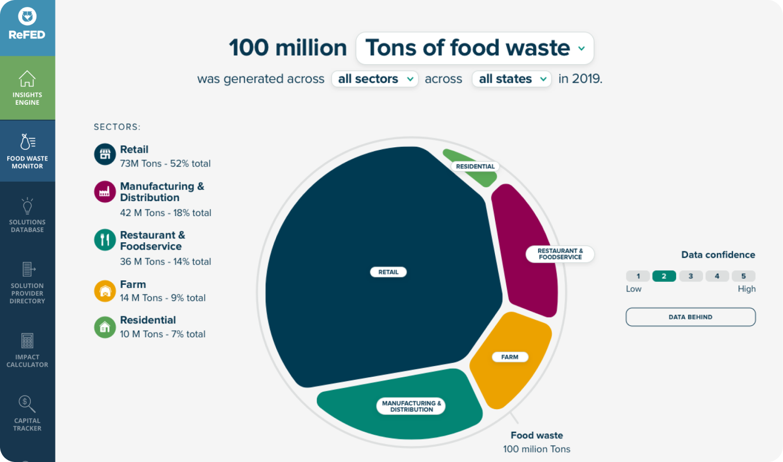
Through that, we were able to create space for and draw awareness on the other elements of the platform: the scale of the food waste problem, the possible solutions, and allowing the tracking of capital flows. Eventually, we moved from the idea of a map to an online knowledge hub with the most comprehensive examination of food loss and waste in the United States.
Beyond maps:
Therefore, while creating maps can be seen as a core part of our business, we also work on a wide range of other projects that involve data visualization and analysis. These projects might include:
- Decision Support Tools: We develop tools that enable decision makers to model and analyze complex data, such as climate risk or forest management.
Example: The Forest Innovation Platform is a tool we are developing that enables modeling and analysis of climate vulnerability in US-based forests. This platform allows users to input data on forest type, location, and climate change scenarios, and then provides outputs on climate risk, forest health, and management options. This project requires us to work really closely with stakeholders from the US Forest Service and other organizations to understand their specific needs and challenges.
- Interactive Dashboards: We create dashboards that allow users - from the general public to policy makers - to explore and visualize complex data in real-time.
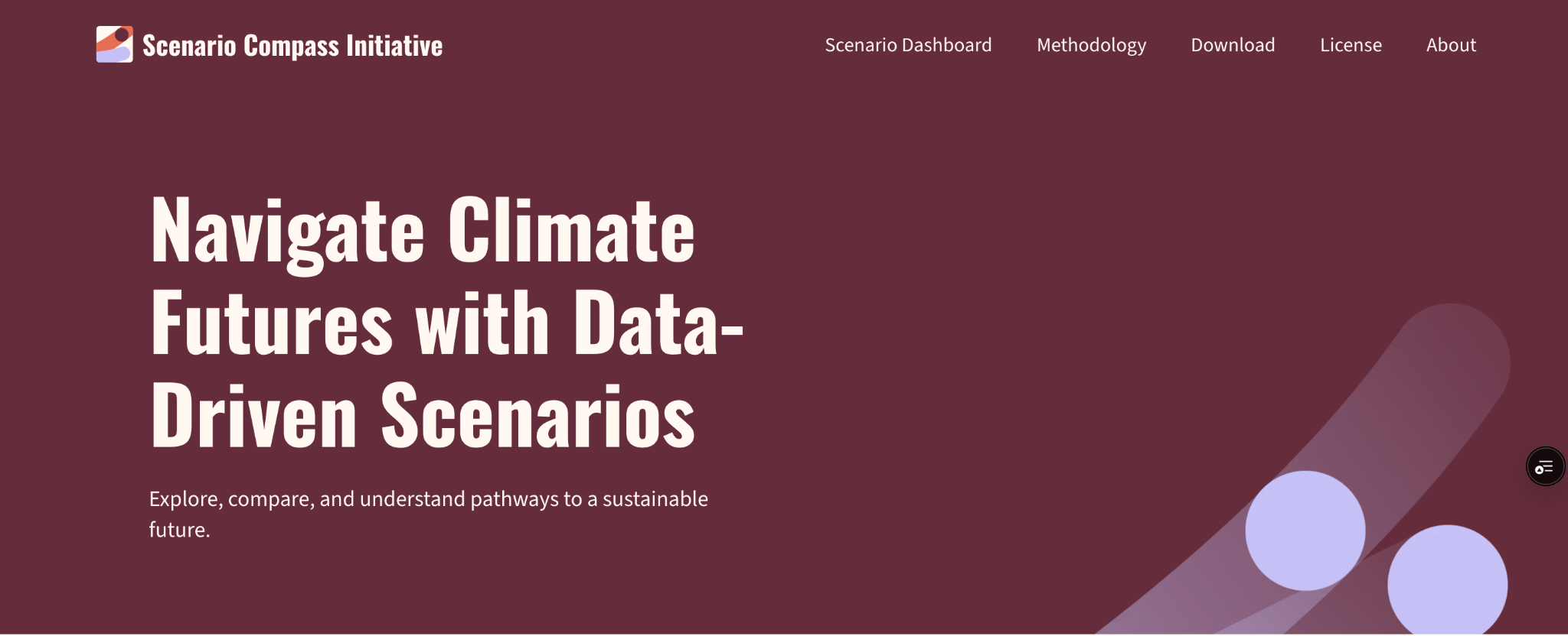
Example: The Scenario Compass Initiative for IIASA (International Institute for Applied Systems Analysis) is a live database and interactive dashboard that allows users to explore and compare thousands of climate scenarios. This dashboard enables users to input and compare scenarios according to their needs, and then provides outputs on scenario categorization, climate risk, and decision-making criteria. This project involved collaborating with leading organizations in the global climate community to make thousands of climate scenarios more usable and accessible for decision-makers.
- Storytelling Platforms: We build platforms that enable users to share and explore data-driven stories, such as those related to environmental or social issues.
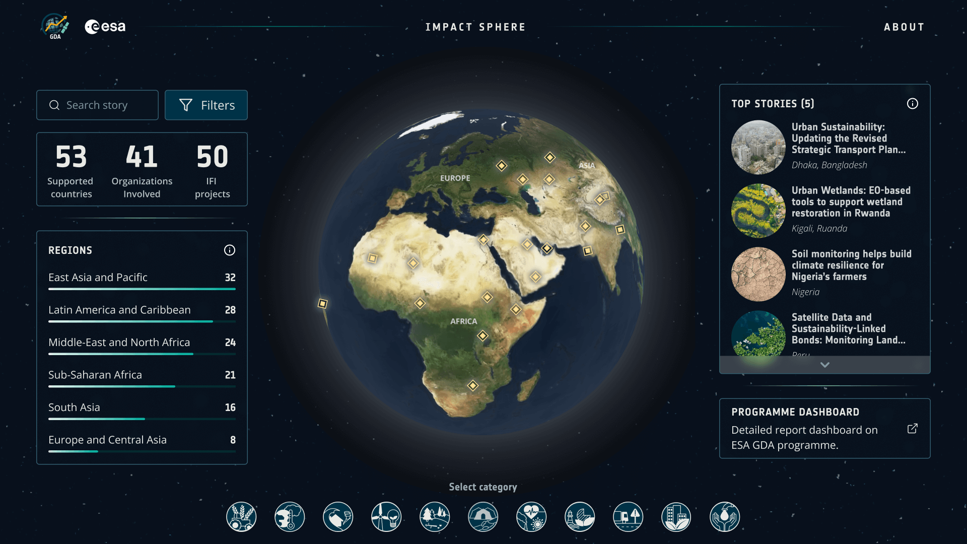
Example: For the European Space Agency (ESA), we developed the GDA platform enabling users to explore and engage with impactful stories from the successful projects of the GDA program. This project was a real challenge both in terms of processing the client’s data and in creating the stories. In fact, while the project leverages high-quality data from renowned providers, a key challenge lies in automating workflows to process the wide variety of data formats coming from multiple sources —each with its own characteristics, styles, and intended uses— into layers used within the platform. Then, story creation adds another layer of complexity: once the data layers are prepared, the narratives must be assembled through a CMS, a largely manual process that often involves integrating charts, images, and other resources that enhance and contextualise the story.
Thematic expertise and team flexibility.
With years of experience in data visualization, our team of scientists know that environmental issues are often map-based, but also that a map isn't always the answer. Our thematic expertise and team flexibility have helped us understand our clients across different sectors and projects, and eventually come up with a solution that was the best fit for what they wanted.
- For example, our ongoing work on the Forest Innovation Platform involves translating complex climate data into actionable insights for forest managers.
- Similarly, the Scenario Compass Initiative (soon live) involves translating thousands of scenarios into usable and accessible formats for decision-makers.
These projects required us to work closely with our clients to understand their needs and develop solutions that would address those needs in the most meaningful way - with sometimes a different result than what they had envisioned.
So, as we wrap up this post, you might wonder: How do we take complex information and turn it into something that's not just a visualisation, but actually tells a story? This is where "translating data" comes in and it's a topic we'll explore in-depth in our next blog.
We'll discuss the challenges and opportunities associated with what we call “data translation”, and share examples of projects where we've successfully translated complex data into actionable insights for our clients.
Stay tuned!
Explore more examples of our team's work:
Map visualizations:
- Aqueduct Project Map Visualisation
- Global Fishing Watch: https://globalfishingwatch.org/map/?locale=en
- PREP Project: https://prepdata.org/dataset/cum_pr_rcp45_decadal
- Global Mangrove Watch: https://globalmangrovewatch.org/
- Resource Watch: https://resourcewatch.org/data/explore/Powerwatch
- Open Data for Resilience Initiative: https://www.opendri.org/about/
- Spatial Database for South Asia: https://spatialdatabase-southasia.herokuapp.com
Graph and tabular widgets:
- Global Forest Watch Dashboard Graphs and tables
- Resource Watch: https://resourcewatch.org/dashboards
- Insight to Impact Countries Dashboards: https://i2ifacility.org/data-portal/IND
Visualization comparisons and timeline animations:
- Climate Watch Country Comparison
- PREP Project Spatial Comparison
- Fishing Watch Timeline Animation
- Neptis Timeline Animation
.png)